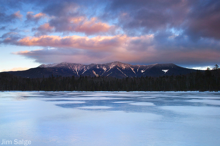
Lonesome Lake Sunset...

vftt.org

Help Support vftt.org:

This site may earn a commission from merchant affiliate links, including eBay, Amazon, and others.

w7xman

Active member
Joined
Sep 25, 2005
Messages
714
Reaction score
200
Location
Epping, NH
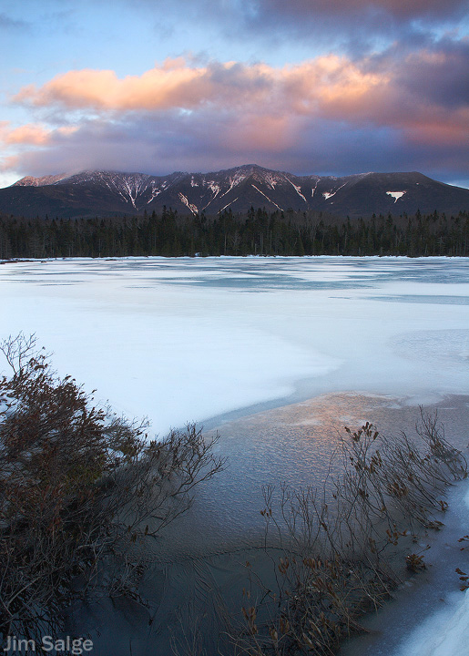
I find that middlegrounds that end in a vertical wall and horizontal layers pose challenges in composition that are difficult to overcome. I am curious if you all might pen your thoughts on this shot, whether I've succeeded in bridging the foreground with the background with the lines on the ice, or if I've again created the dreaded two shots in one...

Honest critique appreciated!

Thanks in advance...

Canon 20D w/ Sigma 18-200
0.6 Seconds @ F14
ISO 100
Polarizer + 2 Stop Soft GND
2190497675_1838f48a6a_o.jpg
 
What a nifty picture! I really like the four subjects in it: sky, mountains, frozen lake, open water and the way they are presented, almost collage- or mosaic-like.

The one suggestion I’ll make is to crop a little at the bottom, to eliminate that little patch of ice in the lower right corner.

G,
 
I'll put it this way: I tried a few other crops, and I can't make it any better.

As usual with your photos, I can tell that a lot of care went into getting the exposure right in the different areas of the photo. This pays off handsomely in this photo, where subtle details like the thin surface crystals in the foreground, or the slight changes in wetness of the ice in the middle ground, are there to reward close examination of the photo. Whenever I see an evening shot I wonder if the cloud color has been boosted a little, but I'm probably just seeing the effect of the GND filter.

The presence of the leads (freshwater polynyas) certainly does help, and there's even a visible line formed by the edge of the darker wetter ice that starts at the far edge of the foreground lead and curves out to the left into the middle space. (Maybe you could burn along that edge a tiny bit?) If you had blue water coming further into the foreground, the transition would be easier, but it's most of the way there already.

(I say keep the snow patch at bottom right, it strengthens the vertical line of the foreground brush.)
 
Last edited:
When I first looked at this image, the large white area in the center turned me off but the more I really looked at this image, the more I liked it. The large white center area became an expanse of whites and blues and grays with nice diagonal lines. The branches in the foreground created some solid depth to the scene and the clouds over the ridge added color and drama. However, the one thing that kept bothering me over and over was the large white snow patch in the upper right. No matter where I looked, my eye was drawn to that spot. So I took the liberty of cropping that edge of the scene along with some blank sky at the top and punching up the saturation a little bit to get some more color in the water. I'm not sure if this is any better than Jim's original, since the nice clouds in the upper right were lost.

Anyway, nice shot, Jim. Your visualization and technique are very pleasing.

JohnL
 
I think, Jim, that you may have (at least to some eyes) the "dreaded two shots in one". I'm not sure the bottom half stands alone, however. I like it as-is, although I sort of wish the trees either jumped out more or faded into the mountains better. And, I can see Doug's point about horizontal format. My wife likes that better too (as you may recall she picked the popular one of Liberty with the undercast...)

I'll say this -- I have become much more fond of portrait/vertical shots after participating in the photo forum. I used to be "oh scenery, that's got to be landscape". The downfall of portrait is it doesn't fit my 16:10 monitor desktop :(

Tim
 
Jeez, I wish John L never had mentioned that bright spot in the mountains! Once you are aware of it, your eye does tend to be drawn there, as often is the case with brightly contrasting features that stand sharply out from the dark background in a scene.

But I would not crop it out.

As for the “dreaded two-shots-in-one” business, as noted above I actually see four subjects here: sky, mountains, frozen lake, open water. That’s breaking the rules 2X.

But it works in this case.

None of the four elements in this collage / mosaic is a dynamite stand-alone subject, in my opinion. Nice, maybe; just nothing extra special. Yet together as we see them in this picture they make a very compelling (visually) scene. The problem of several pix in one has been deftly handled to produce synergy – the whole is much greater than the sum of its parts.

G.
 
Thanks...

Thanks for all the thoughts, I am hearing alot of what I'm feeling about the shot, and some new ideas and ways to look at it. I appreciate all the time that you have taken to comment.

For those who mentioned a horizontal, landscape alternative, I did shoot it. I think that it is nice, but a bit too straightforward for my tastes...I like to try to create dynamic images...and sometimes it works!

Thanks again!

2196571655_1e8eba454a_o.jpg
 
Sorry to be a little late commenting. When I first looked at the image two days ago (and is my habit before reading the text), I had trouble reading the image. It really appeared as two images, each with a sky, one stacked above the other. I partly chalk this up to my feeling loopy (trying to shake the flue). I raise all of this only because I think the image is a bit difficult to read. I nonetheless like the image and the bold composition. It is unfortunate that there is not more reflection of the alpenglow on the lake surface, because that might have tied the composition together more. But as we all can see that was not going to happen.

The horizontal you posted today is a significantly different image. I think it also works, even if it is now a somewhat more static, 3 in 1 image. But there are several reasons why I like this horizontal which have nothing to do with the format. The sky is more interesting. The saturation in the alpenglow is more intense. There are more gradations of color on the lake surface. We can read the ice patterns better (partly because they now just are larger), and that section of the lake surface is to me far more interesting than the foreground lake surface in the vertical.

One possible tweak would be to increase the subtle color saturations on the lake surface in the vertical. Maybe it would show the greater gradations seen in the horizontal. Also if the vertical was printed/displayed as wide as the horizontal, then the ice patterns would read as well as the horizontal.

Count me as another contrarian in that I prefer the later horizontal image you posted today. However, both images are very good and do work for me.
 
Last edited:
Beautiful colors and tones going on in the image. I like how the alpinglow is reflected in the water. It helps tie top and bottom of the image together.

Unfortunately, the white of the ice tends to cut off top from bottom, as others as observed. What's nice in your second image is how the darker blues in the water tend to wander back, drawing the eye toward the forest and mountains in the background. Perhaps if you can darken some of the ice and water (in post processing) in the first image, you could create a leading line toward the background.
 
I like them both, and I agree with Tim about warming up to verticals.

What is a good all around ND filter for this type of image?

happy trails :)
 
I was thinking there might be too much sky in both pictures. Would a David Muench-like composition work with the first one? Point the camera more toward the open spot of water and cut it off at the top just above the mountains?

On the second image, the interest for me is entirely in the middle section. A panorama-like narrow crop might be worth trying.
 
Top